Using High Time Frame Charts to Predict Short Term Moves
Read Time: 4 Minutes
Day Trading Lessons: 10/9/23 - 10/13/23
Last Friday's bullish momentum carried over into this week as we saw three more days of buying pressure before the bears finally stepped in on Thursday and Friday.
I traded lightly on Monday and Tuesday but then I started to feel a sense of burnout on Wednesday and Thursday. It's the first time since I began trading 5 or 6 months ago that I woke up without a burning desire to trade.
I still ended up going through my trading routines and I still watched the charts, but by Friday, it was pretty clear that I needed to take a break.
So that's what I did. I took Friday off. No pre-market analysis, no trading, no looking at the charts. Nothing. Just a nice day off to recharge and spend time with my kids.
I'm hoping the break with reignite my trading enthusiasm and lead to a big week ahead but we'll have to wait and see.
Now, with all that said, I still found time to study and level up my trading skills. Here is my big takeaway/learning lesson from the week:
Zoom In on the High Time Frame Charts
Every morning, during my pre-market routine, I analyze the $SPY 1D, 4H, and 1H charts. Doing this gives me a big-picture overview of where $SPY currently is on the chart and where it has come from. It also helps me identify major support/resistance levels, trendlines, and channels. But this week, my trading mentor mentioned that I should also be zooming in on the high time frame charts. In hindsight, zooming in is an obvious move but for whatever reason, it hadn't even crossed my mind to do it.
By zooming in, you're able to read the current price action, which makes it easier to predict what will happen on a day-to-day basis. Let's use the daily chart from last week as an example. If you look at the zoomed-out chart below, you'll notice a few things:
- We've been in an uptrend for the last year
- $SPY recently put in a lower high
- $SPY recently broke below a major trendline/channel
- $SPY recently bounced off a major support level after a violent push down.
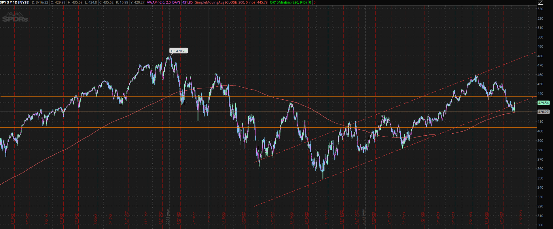
Those are great "big picture" takeaways, but they don't do a ton to help us predict what will happen tomorrow. For that, we need to zoom in. If you take a look at the zoomed-in daily chart below, you'll see the following:
- The bullish hammer candles (yellow arrows) indicate that the bulls have stepped in to push the price higher. Seeing hammer candles like that can be a signal of market strength and from my experience, they usually lead to an additional 2-3 days of buying pressure.
- The big gap down (pink arrow) tells us that the bears are firmly in control. Typically, a big gap down like that will be followed by multiple days of selling pressure (and vice versa for big gap ups).
- We are putting in higher lows (white arrows), which gives me an overall bearish bias.
- $SPY hit a big support level at around $420. For three days, buyers stepped in at this level; indicating short-term strength and leading to the big push up on Friday.
As you can see, there are valuable insights to be gained from both versions of the daily chart. If you're looking at just one, you're not getting a complete picture of what $SPY is doing. And don't forget to do the same thing with other high-time frame charts. Zooming in works just as well on the 4H and 1H charts.
That's it for this week's newsletter. I hope this little lesson will help you as much as it has helped me.
Have a great week ahead!
- Eric
Join the Day Trading Inner Circle
Follow along as I strive to become a profitable day trader. Every Sunday, I send out an email with my weekly trading stats plus the most important learning resources that I discovered that week. Drop your email in the box below to join the inner circle.
Home Newsletter Signup
Previous Issues of Side Hustle Steroids